Health & Wellness
Alloy Health
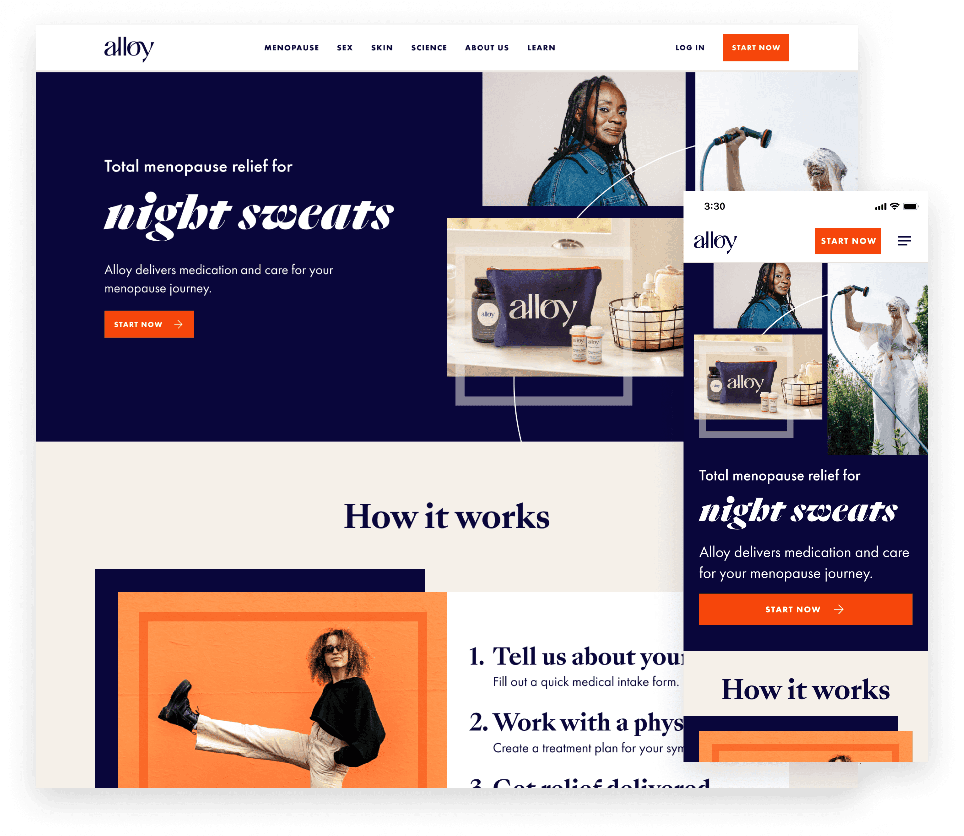
A complete patient experience redesign, 2+ year fractional Head of Design role, clarifying treatments, medications, and subscriptions across the entire journey.
Client
Alloy Health
Timeline
2023–2025
Service & Offer
Sector
Platform
Alloy is a menopause telehealth company providing education, care, and prescription medication. I was brought in to evaluate and rethink the patient experience as they expanded into skin, gut, and sexual health categories.
Challenge
As Alloy's treatment categories multiplied, the path to care became opaque. Patients didn't understand which treatments were prescription medications versus lifestyle recommendations, and they spent excessive time messaging doctors just to understand their options. The navigation didn't expose these distinctions, and the intake flow couldn't accommodate the expanded scope without becoming overwhelming.
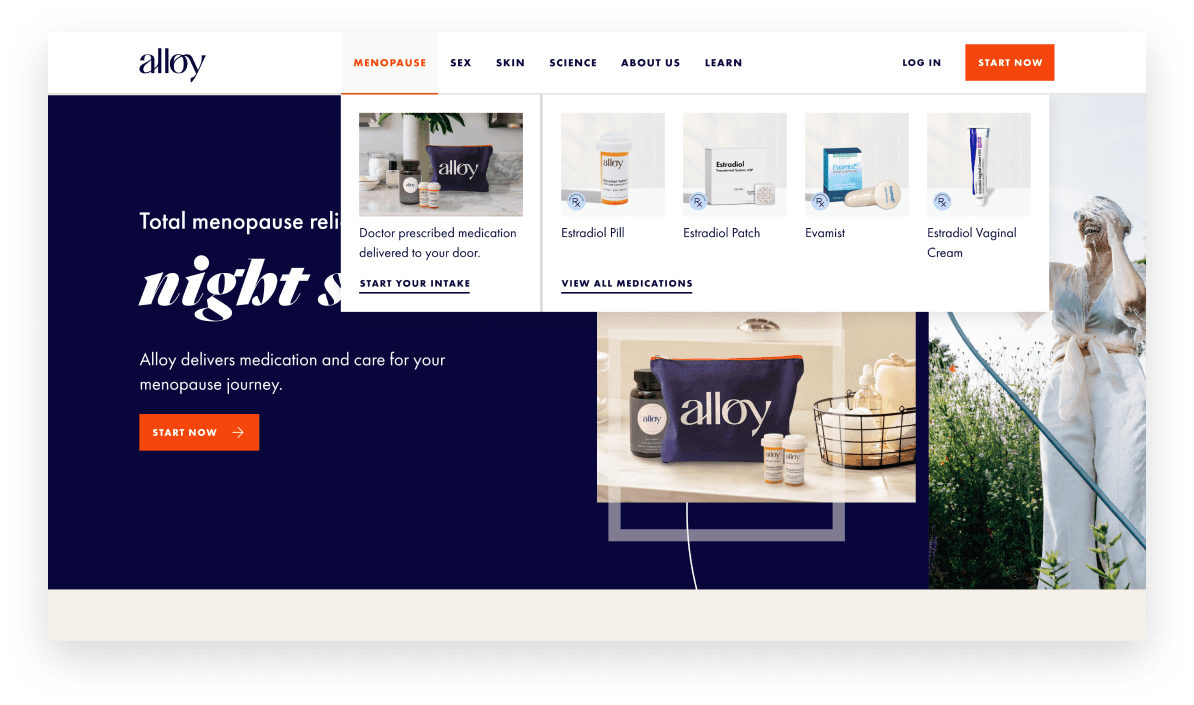
Navigation updates expose the product categories and show medication instead of lifestyle imagery to help customers understand what Alloy offers.
The Approach
I led a team of 2 designers and one design researcher. We worked directly with the founders, product lead, and CTO to redesign the entire patient journey. The strategy was to clarify treatment types at every touchpoint, educate patients before intake, and create a flexible flow that served both informed patients and those needing guidance.
Key Changes
Navigation and content
Updated the homepage and category pages to expose treatment types visually. Instead of lifestyle imagery, we prioritized medicine bottle iconography and clear explanations of what each treatment was, how it worked, and the evidence supporting it.
Intake redesign
Restructured the flow to ask upfront whether patients had a specific treatment in mind or wanted doctor guidance. This simple branching removed the friction of a one-size-fits-all questionnaire while clarifying the doctor's role in reviewing medical history and determining prescriptions.
Post-checkout continuity
Extended the same educational approach into the patient dashboard and onboarding after purchase. The post-checkout experience was as supportive as the pre-checkout flow, helping patients understand their treatment plan and next steps without requiring additional doctor messaging.
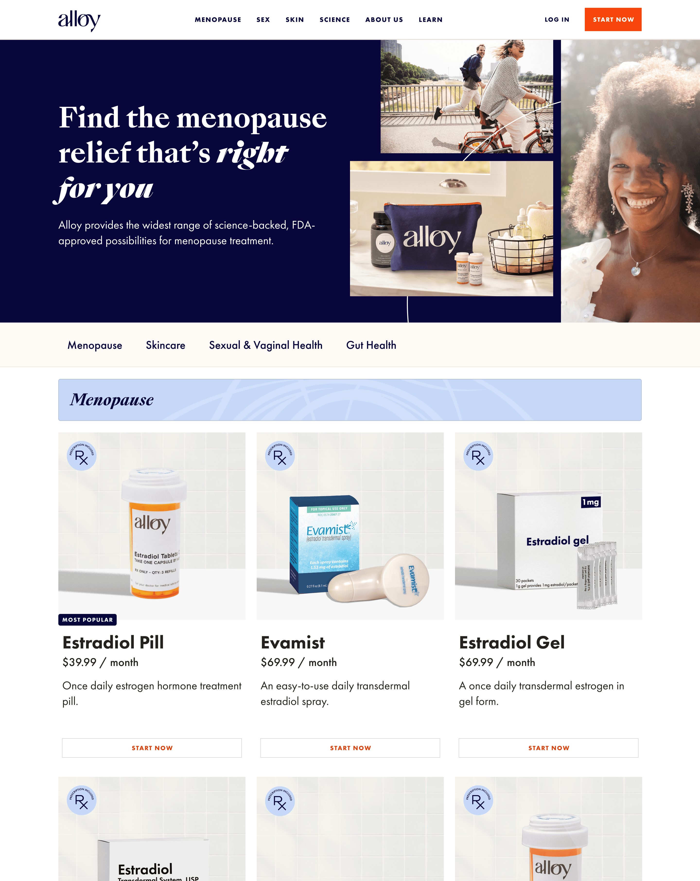
A product listing page exposes all the solutions with short descriptions to make comparisons easy.
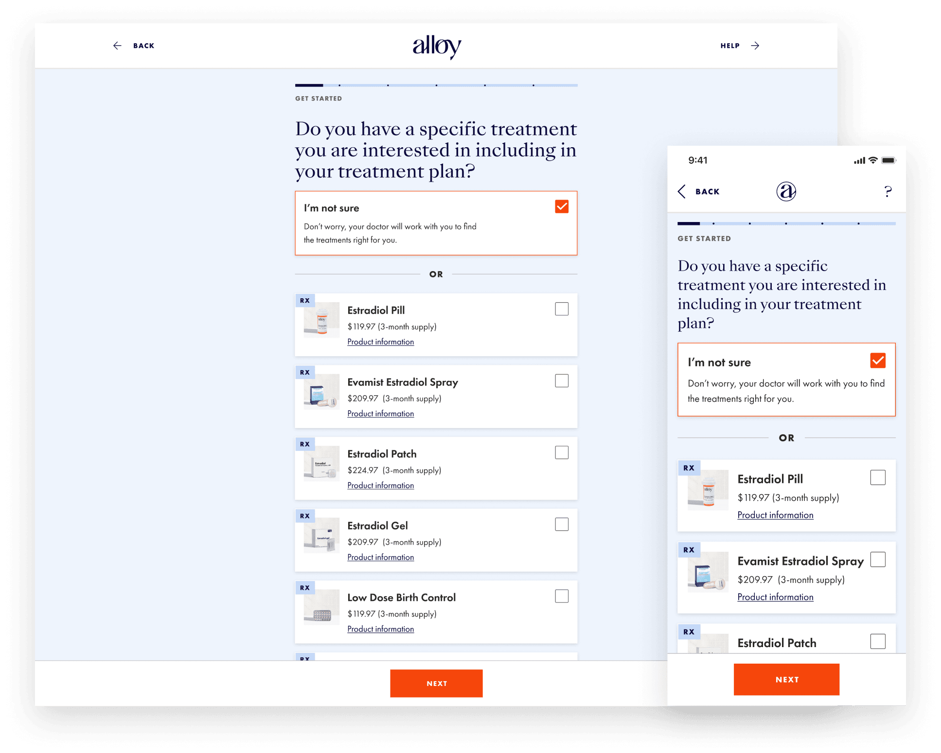
The intake was shortened and a "I'm not sure" question was added to help patients who didn't know what they needed yet.
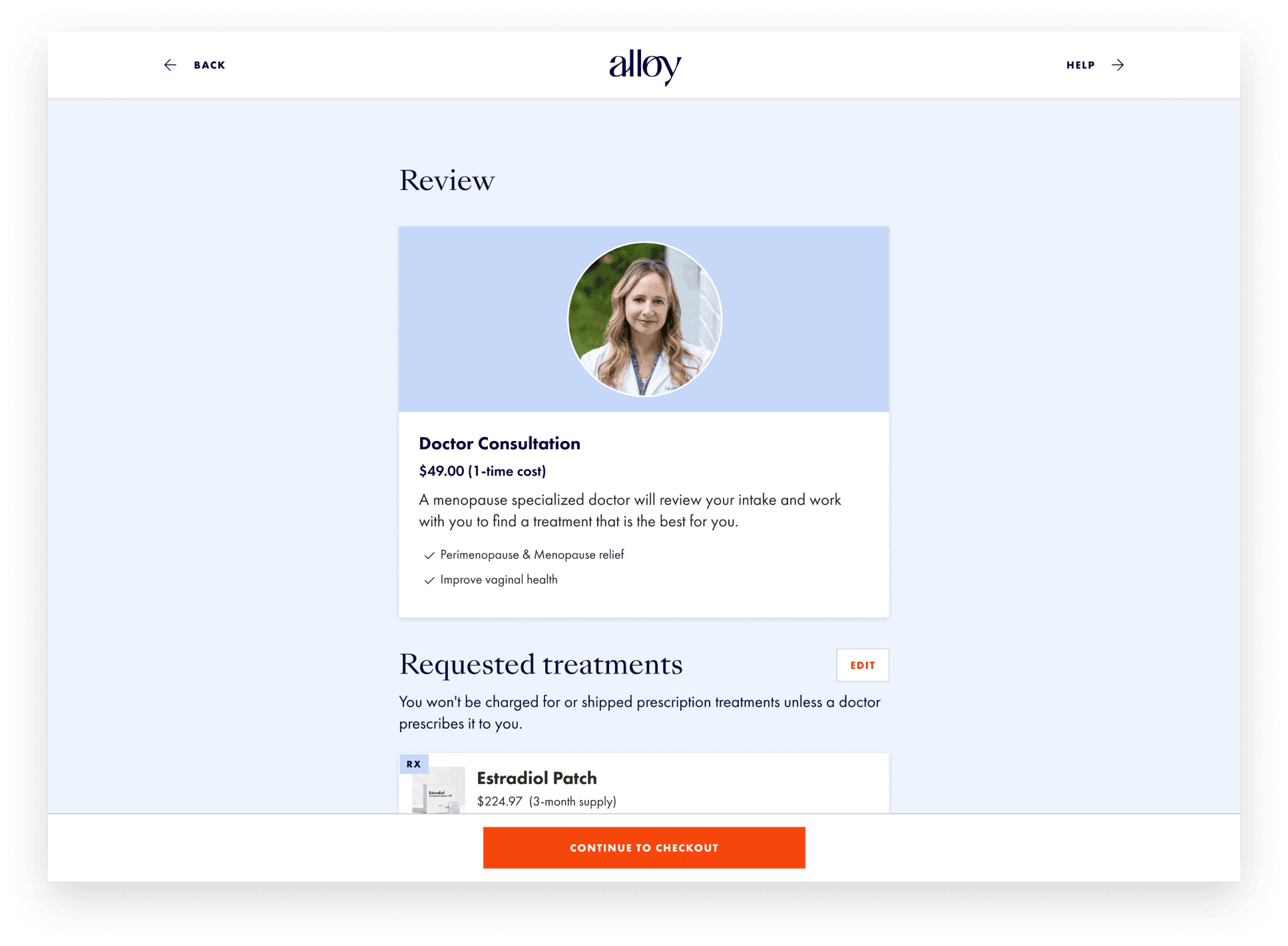
The doctor consultation was reimagined to help patients understand what they were getting.
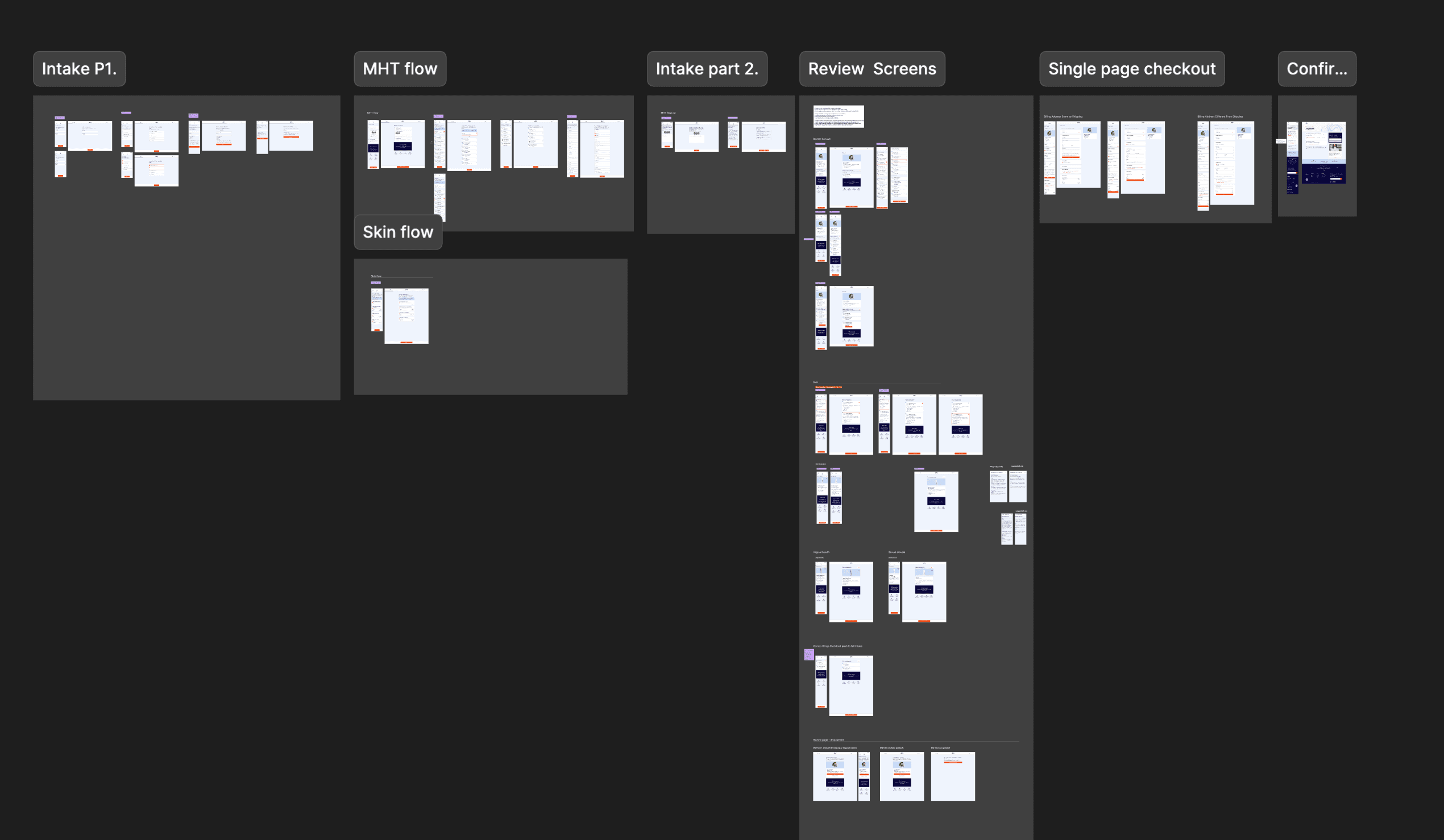
A redesigned intake flow that could fork depending on the different path the patient took.
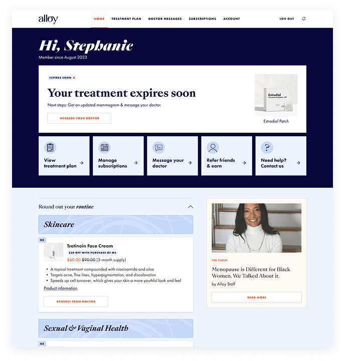
Dashboard that exposes the actions the user can take
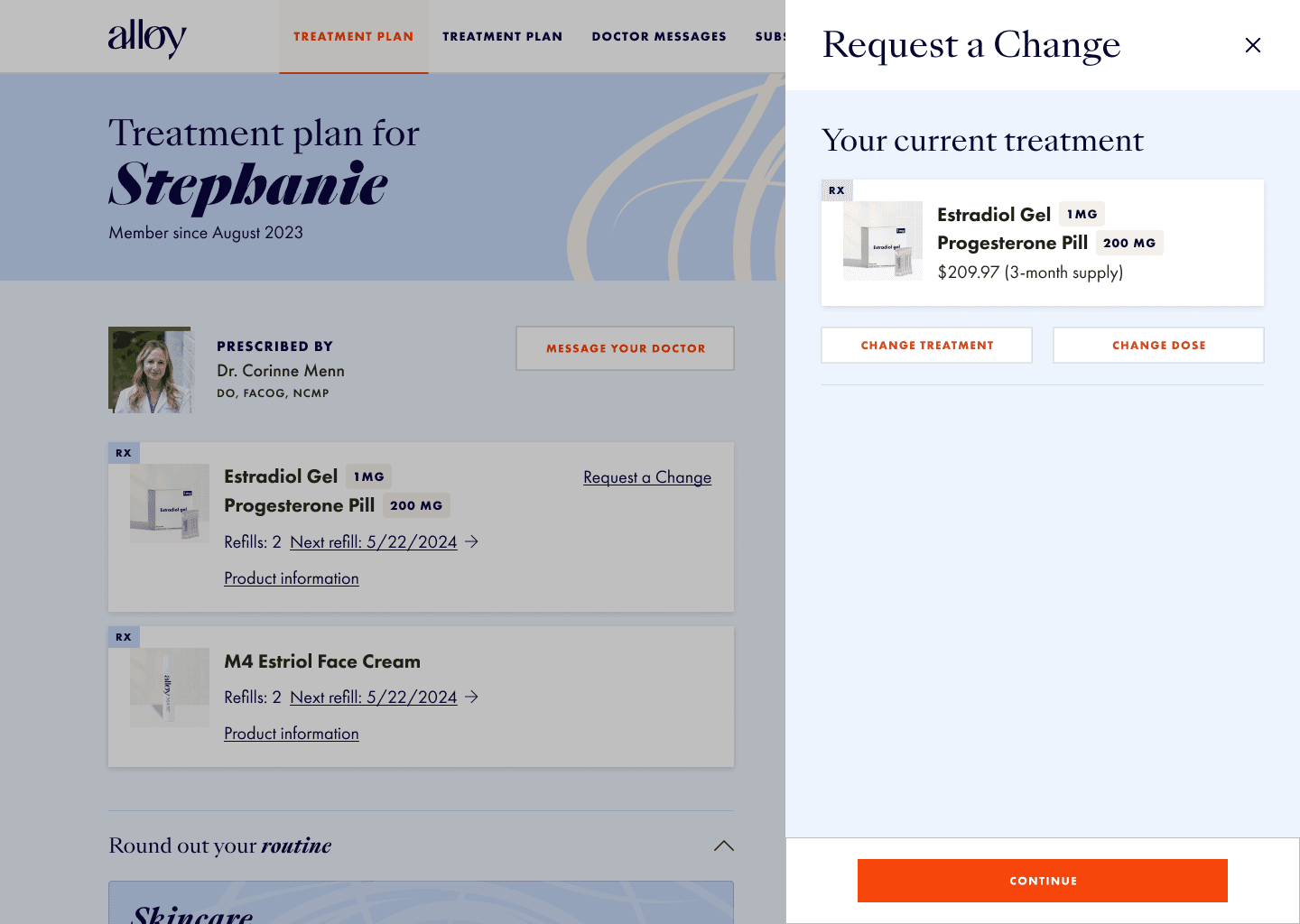
Ability to request new treatments easily.
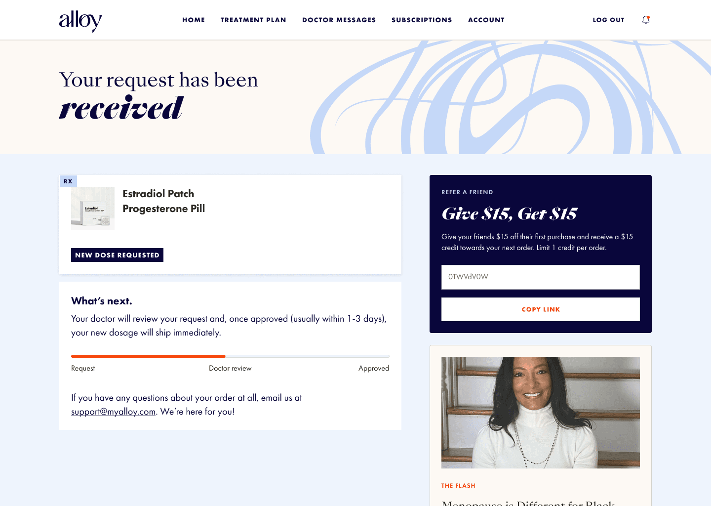
A confirmation the helps the patient know what to expect next.
Outcome
Conversion doubled. Patient satisfaction increased because they made more informed decisions before talking to doctors, reducing unnecessary messaging. The streamlined intake and mobile-friendly design improved completion rates and reduced drop-offs. The expanded navigation supported new categories without requiring app updates, giving Alloy flexibility as they continued to evolve.
“Working with Everyday Industries has been a game changer for Alloy Health. From absorbing our complex user flow to navigating upgrade needs to working seamlessly with our team, they brought meaningful value to our entire user experience.”
Anne Fulenwider, Co-Founder at Alloy Health
Looking for my next team.
I’m looking to move in-house as a principal or staff product designer that solves complex problems. If that sounds like your team, I’d like to hear about it.